Live Sale
Rebuilding the information hierarchy of Motorway's live sale
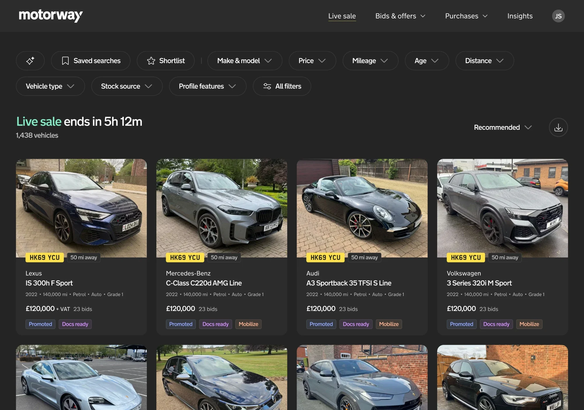
Motorway Pro kept gaining features and information to help dealers buy better — but the experience underneath hadn't really changed in years, and it was getting harder to show the right information in the right place.
Following a wider Dealer UX Audit, I led the design of a new information hierarchy for the live sale: a clearer, more scalable structure for how dealers discover, evaluate and compare vehicles.
The goal was to make important information easier to understand, reduce overload and give future features — especially ones designed to influence dealer behaviour — a sensible place to live.
- Role
- Design Lead
- Product
- Motorway Live Sale
- Platform
- Web desktop & mobile
- Focus
- Strategy, design & IA
The problem
More information wasn't necessarily creating a better experience.
Motorway Pro's core experience had barely changed in more than four years. Meanwhile, new information — paid listings, early documents and other vehicle signals — kept being added to an interface that was never designed for it.
That created three problems:
- Overload: dealers saw a lot of information with no clear sense of what mattered most.
- Poor discoverability: important details and differentiating signals were easily buried.
- Slower product development: with no rules for presenting new information, every feature reopened the same design questions.
The Dealer UX Audit pointed to a bigger opportunity: helping dealers find relevant stock, trust vehicle condition and move through buying with less friction. The information hierarchy tackled the structure underneath all of that, rather than individual usability issues.

Discovery & research
Looking beyond the interface to understand the rules behind it.
The audit showed the problems. Solving them meant understanding how dealers process information when they evaluate a car.
I reviewed how leading marketplaces organise information — Airbnb, eBay, Vinted, Etsy, Amazon, Rightmove, AutoTrader, CarGurus, BCA and Manheim. Across very different markets, the same pattern held: the best marketplaces order information the way buyers make decisions.
1. Item — what is it?
The identity and quality of the product.
2. Price — is it good value?
The financial proposition.
3. Listing type — how is it being sold?
The transaction or stock context.
4. Seller trust — who is selling it?
Confidence and credibility signals.
Motorway Pro didn't follow this sequence consistently. Seller, listing and vehicle information competed for attention, just when dealers needed to focus on the car itself.
That gave us a clear direction: one hierarchy, applied consistently across vehicle cards, filters and the vehicle details page.
The solution
One hierarchy, applied across the live sale.
Rather than redesigning each screen in isolation, we set principles for how information should be prioritised across the whole discovery and evaluation journey, so every piece of information had a clear purpose and place.
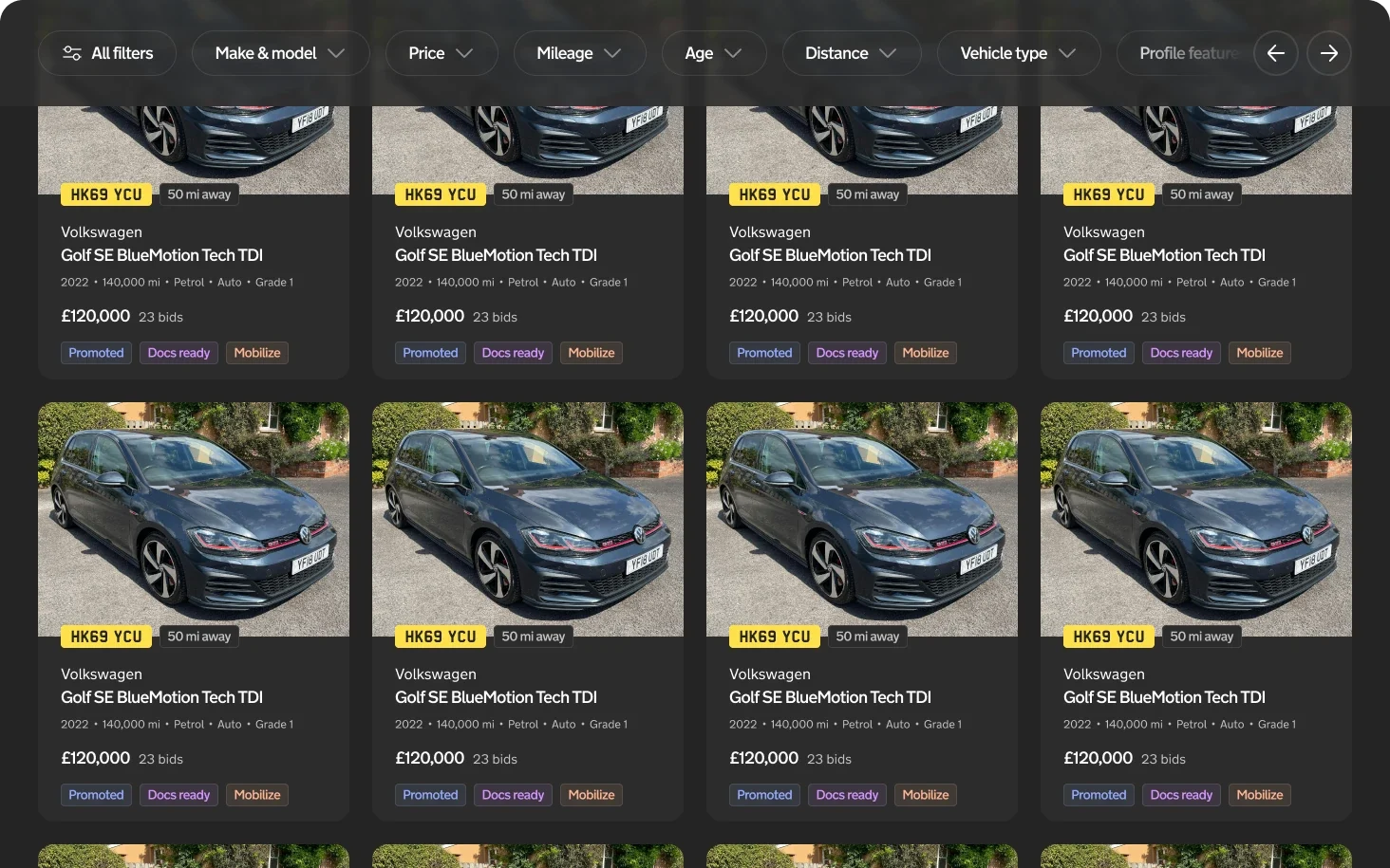
01. Vehicle cards: earn the click
Cards need to help dealers scan a lot of stock quickly, so they should show only what's needed to decide whether a car is worth a closer look:
- Vehicle imagery
- Make and model
- Key specs: year, mileage, fuel and transmission
- Price
- No more than three distinguishing signals
That drew a clear line between the card, for choosing, and the details page, for investigating. The photo was protected too: it's the most important thing on the card, so any badge competing with it had to earn its place.
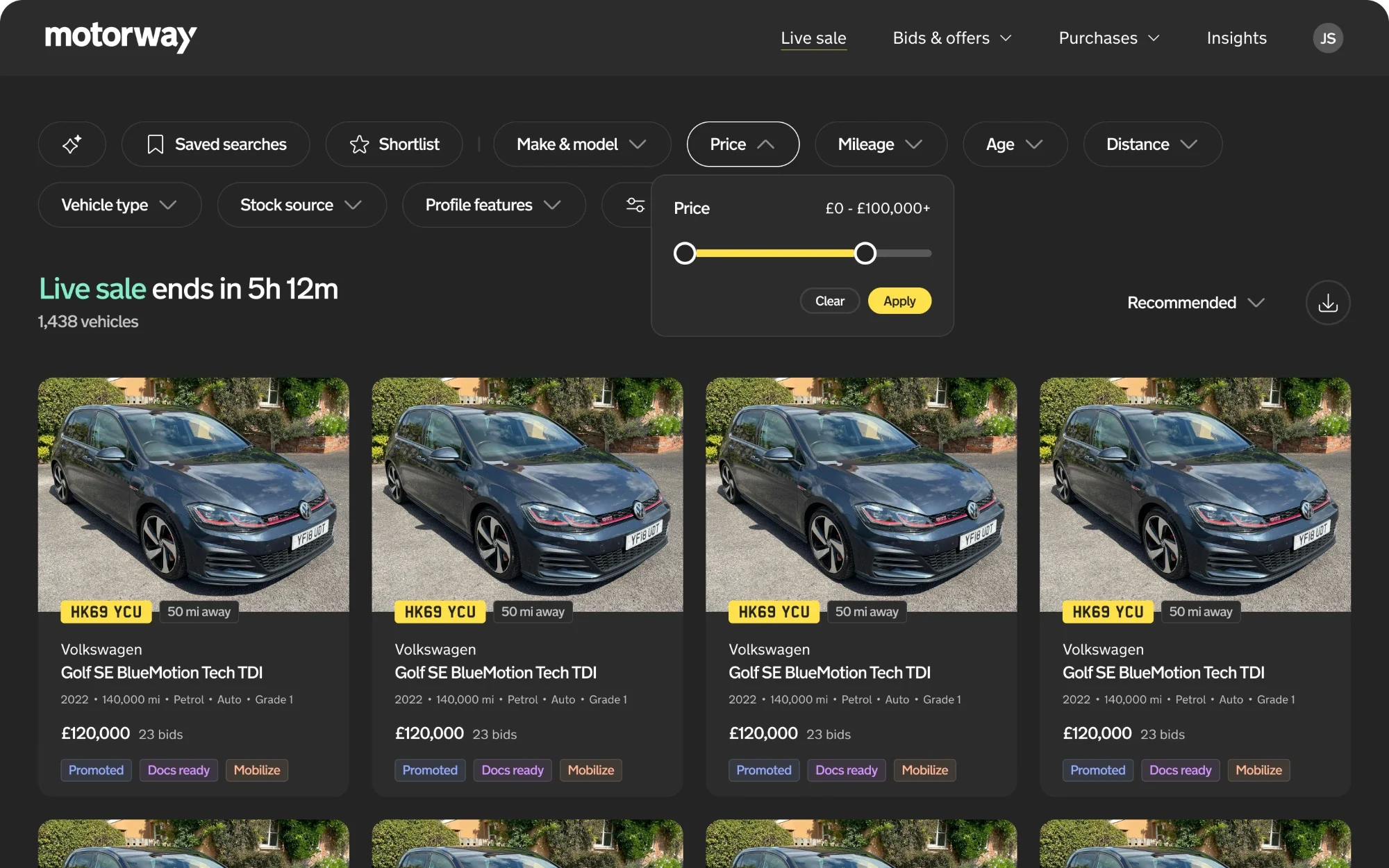
02. Filters: prioritise what dealers use
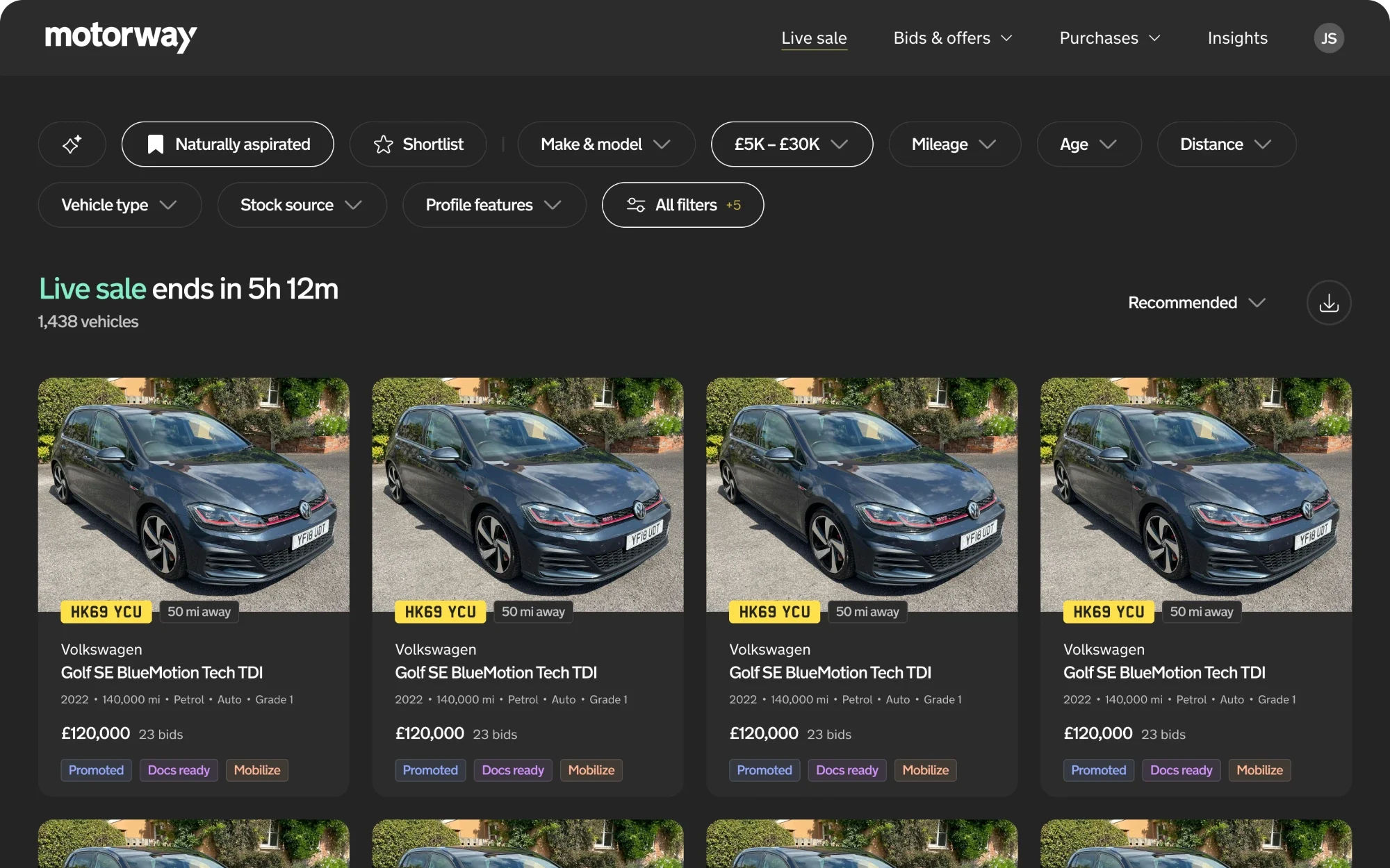
The existing filters exposed so many options that the important ones were hard to find. We ordered them by usage and type instead of treating every option equally.
Frequently used attributes — make and model, price, mileage, age and distance — came first. Seller type and listing attributes, such as paid listings and early documents, got a distinct place of their own. Rarer options stayed available in an expanded view, so the filters became more focused without losing depth.
03. Vehicle details: give information a clear home
The details page should build on the card, not repeat it. The new structure grouped information into vehicle summary, vehicle information, listing information and seller information, each with a clear role in the decision.
New signals, such as uploaded documents or vehicle history, could then be added without crowding out the core vehicle information.
Together, this gave the live sale one consistent framework: a quick overview for discovery, structured filters to narrow the search and a detailed view for evaluation.
Designing for behaviour, not just hierarchy
Making important signals visible without overwhelming the experience.
A big motivation for this work was helping dealers make better decisions through the right signals and nudges.
Earlier work on paid listings had shown that visible seller commitment helped sales, with a 2.56% uplift in conversion from for-sale to gross-sold vehicles. But the existing interface made it hard to add signals like that consistently. The new hierarchy gave us a way to decide which signals deserved attention, and where.
Prioritise commitment.
Shortlisting was the highest-priority nudge: a familiar way for dealers to show interest, and a reason to come back.
Put the car before the seller.
Signals that made a vehicle stand out on its own merits came before information about who was selling it. Trust signals still mattered, but they shouldn't hide the product.
Limit competing signals.
Cards show no more than three distinguishing signals. Where more were available, their impact on conversion needed testing, not assuming.
Keep social proof purposeful.
It was unclear whether other dealers' activity was more useful on individual cards or in a dedicated discovery experience. Rather than force it into the card, we left it open for further exploration.
These principles turned a broad UX problem into a practical framework for judging new features and making consistent design decisions.
Outcomes & learnings
From individual design decisions to a scalable product framework.
The new live sale launched as a 50/50 test in June 2026. Dealers placed more bids from fewer vehicle views, while gross sold held steady: a sign they were finding the right cars faster, filtering better rather than browsing their way to them.
Key results
- +1.18%
- Bids
- More bids placed in the new live sale than in the control group.
- −9.71%
- Unique views
- Fewer unique vehicle views than the control group, alongside more bids.
- −12.64%
- Total views
- Less browsing to reach the same or more bids.
Its value went beyond the results. It gave the team shared principles for what to show, how prominently and where new features belong — and a clearer line between what supports a dealer's immediate decision and what's useful later. That cut the temptation to solve every problem with another label, badge or control.
What I took away
In a complex marketplace, information architecture shapes how people weigh up options, judge value and decide what to do next.
The audit showed that individual features were being held back by something more fundamental: the product had no consistent structure for presenting information. Fixing that meant new features could be designed around agreed principles, instead of repeatedly working around the same limitations.